In today’s fast-paced digital landscape, eCommerce success hinges on more than just a great product offering; it requires an exceptional user experience, and it is in Asia where we can find some of the highest eCommerce penetration rates, with China and Indonesia occupying the top spots at 47% and 32% of retail sales taking place online.
Whether localizing for Asian markets or improving your existing operation, adopting design principles from these leading markets can give your eCommerce a competitive edge.
We understand that the most successful eCommerce platforms prioritize innovative and intuitive design to attract, engage, and retain customers. In this article, we’ll explore advanced UI/UX features and design principles from Asia that help boost the interaction of online shoppers.
East vs. West: Differences in eCommerce Design Principles
The evolution of eCommerce design principles in the East and West is a reflection of deep-rooted societal, cultural, and technological differences between the two regions:
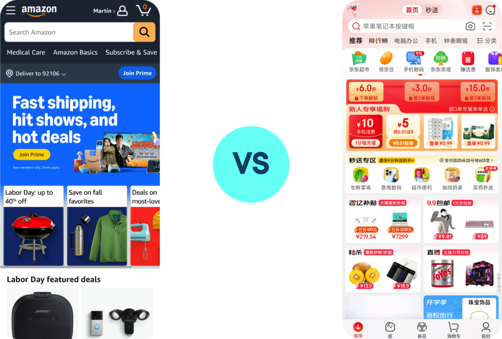
Contrast Between “Less is More” vs. “More is More”
The divergence in UX philosophies between Western and Asian markets is evident, with Western designs emphasizing minimalism and simplicity (“less is more”). In contrast, Asian designs often embrace density and content richness (“more is more”). This contrast is deeply rooted in cultural preferences, where Western users favor whitespace and direct communication, whereas Asian users appreciate dense information and implicit messaging.
From developing your UI and Brand Guidelines, to clickable wireframes and web redesign, our UI/UX design services will transform your online presence and boost eCommerce engagement.
- High-context cultures such as the Chinese influence the preference for information-rich interfaces that may appear cluttered to other audiences but are perceived as efficient by others. When comparing some of the top third-party marketplaces, we can appreciate a preference for minimalist designs.
- Language also plays an important role in IU/UX Design, given that complex languages such as Chinese allow for packing more information into less space. By contrast, alphabetic languages commonly seen in the West necessitate greater negative spacing and information density needs to be carefully planned.
Super Apps and Aggregated Services influence Design Layouts
The rise of super apps like WeChat in China, Gojek in Indonesia, and Paytm in India demonstrates a shift towards platforms that provide multiple services within a single app. This “Everything in One” approach is becoming increasingly popular and is now being emulated by Western companies, and the need to emphasize convenience in navigation across multiple features is certain to impact how UX Design is applied.
From WeChat store setup to Mini-program and H5 custom development, we can help you implement an omnichannel eCommerce approach.
Thumb-Driven Design for Mobile
The concept of thumb-driven design ties into the broader mobile-first mindset prevalent in Asian markets, where ease of navigation on mobile devices is prioritized due to the higher smartphone penetration rates and usage times.
Here the interface is optimized for one-handed use and goes beyond simply making a site mobile-responsive; it’s about designing with the user’s natural hand movements in mind. This approach often includes app-like navigation bars at the bottom of the screen, contrasting with the more traditional hamburger menus used at the top in Western design.
TMO specializes in web design for specific user personas, such as B2B shoppers and senior-friendly eCommerce designs.
Top UI/UX Features Driving Engagement and Conversion in Asia
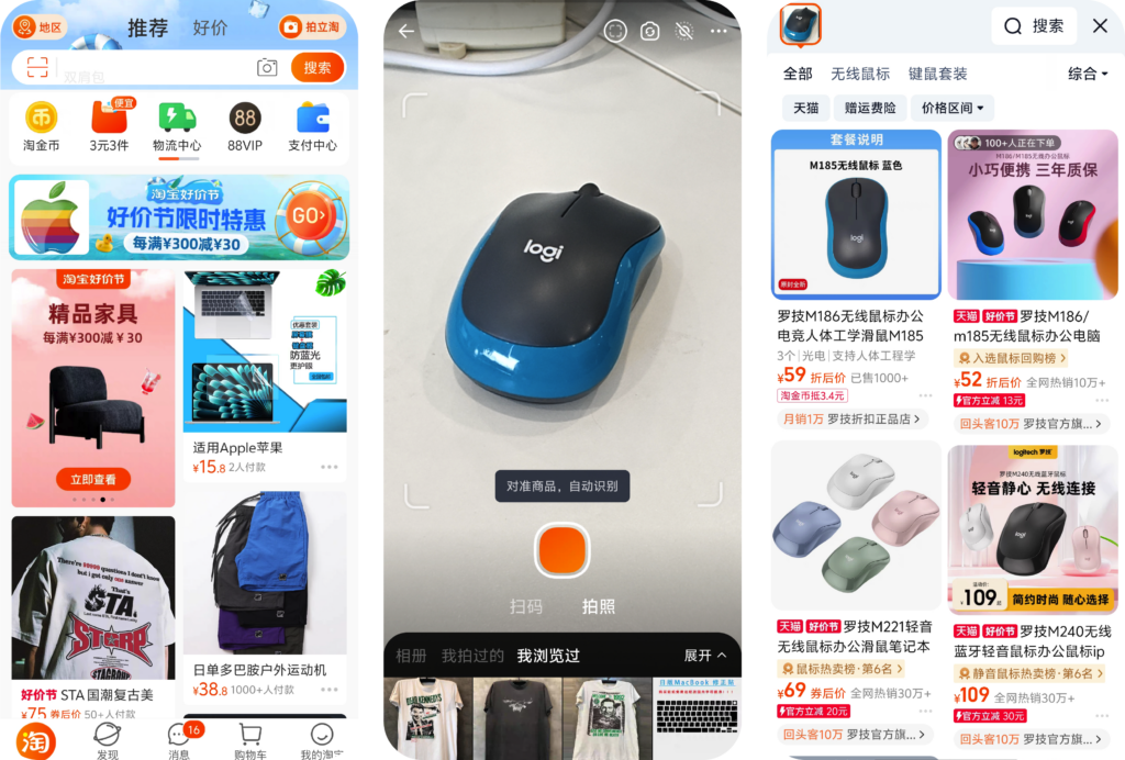
1. Image-Based Product Search
Innovative shopping apps in China have integrated visual search technology, allowing users to upload an image and instantly find similar products available for purchase.
2. Integrated QR Code Usage
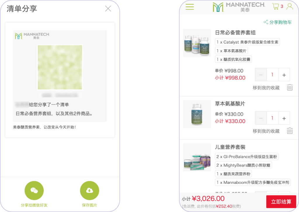
QR codes are ubiquitous in Chinese shopping apps, streamlining various processes such as individual product sharing, shopping cart sharing, order sharing, payment codes, etc.
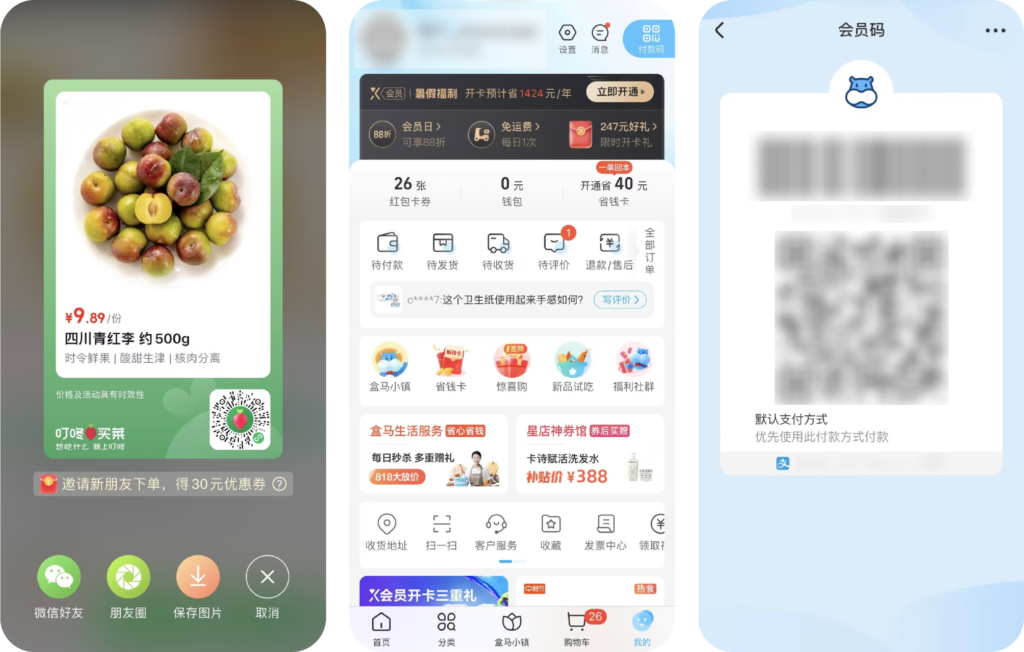
Users can easily share products with friends, send their shopping cart, or share their orders through a simple QR code scan, making the shopping experience more interactive and convenient.
3. Gamification to Enhance User Retention
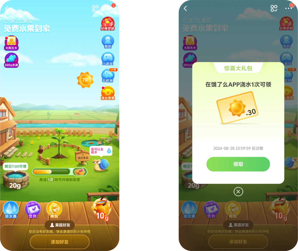
Chinese shopping apps often employ gamification strategies to increase user retention. Gamification elements like daily check-ins, spinning wheels, and interactive tasks increase user engagement by creating a more interactive shopping experience, encouraging them to return to the app.
Several apps such as Lazada or Pinduoduo’s “Duoduo Orchard” game let users grow a virtual tree by purchasing products, and once the tree is fully grown, they can win real fruits
4. WeChat Mini-program Ecosystem
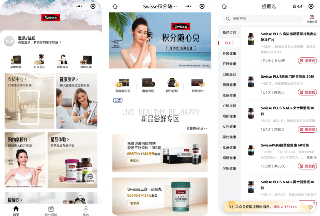
Mini-programs within super apps like WeChat, where users can access a wide range of services without leaving the app, is influencing the UI/UX of eCommerce in Asia by focusing on convenience and user retention, as well as an interface that is designed to match its host app’s design for a more native-like experience.
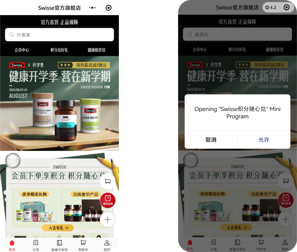
Swisse’s Official Shop mini-program is intricately linked with other specialized mini-programs such as the Swisse Membership Program, Loyalty Points System, and Membership PLUS, creating a cohesive ecosystem that enhances the user experience and expands functionality. This interconnected structure allows users to seamlessly navigate between different programs, each offering unique features and benefits.
5. Private Groups for Coupons Distribution
Private groups within these apps facilitate the targeted distribution of coupons, creating an exclusive environment for users to receive special offers and discounts.
Pinduoduo utilizes private groups as a core part of its business model. Users can create or join groups to purchase products at discounted prices. This social shopping experience is designed to encourage users to invite friends and family, making shopping a communal activity. The platform’s UI makes it easy to form groups and track progress towards group-buying deals.
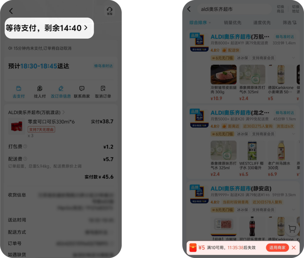
6. Flash Sales and Limited-Time Offers
The prevalence of flash sales and limited-time offers in Asian eCommerce, which create a sense of urgency and drive user engagement are designed with UI/UX principles that focus on quick, easy access and immediate action.
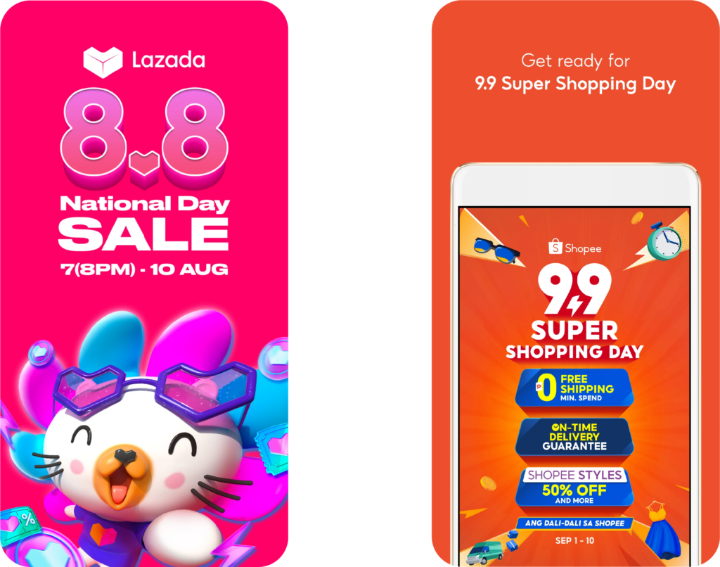
Lazada regularly hosts flash sales where products are available at heavily discounted prices for a limited time. The app’s UI is designed to create urgency with countdown timers, limited stock indicators, and easy access to flash sale items right from the homepage.
7. Floating Quick-Action Buttons
Many mobile apps and mini-programs use floating quick-action buttons within their interface to enhance user navigation. These buttons typically include shortcuts to the home screen, shopping cart, chat support, and a “flash sale” section. The floating nature ensures that these key actions are always accessible, improving user convenience and interaction speed.

These features add another layer of depth to the UI/UX strategies used by eCommerce platforms in Asia, highlighting how localized and innovative design solutions cater to specific user needs and behaviors.
How to Implement These Features in Your e-Commerce Platform
Adopting these advanced UI/UX features doesn’t have to be daunting. Here’s how you can integrate them into your platform:
1. Start with Mobile-First Design: Ensure your platform is optimized for mobile devices, with a focus on simplicity, speed, and user-friendly navigation.
2. Integrate Social and Community Features: Add social sharing options, user-generated content, and review systems to build trust and encourage engagement.
3. Utilize AI for Personalization: Leverage AI to offer personalized recommendations, content, and promotions, making each user’s experience unique.
4. Experiment with AR and Gamification: Consider incorporating AR for virtual try-ons or gamifying the shopping experience with rewards and interactive elements.
The Role of a UI/UX Design Agency in Your eCommerce Success
At TMO, we specialize in transforming eCommerce platforms with cutting-edge UI/UX designs that not only meet but exceed user expectations. Here’s how we can help:
- Expert Consultation: Our team will work closely with you to understand your business goals and target audience, ensuring a design strategy that aligns with both your brand identity and the target market’s preferences.
- Custom Design Solutions: We’ll create a tailored UI/UX design that integrates the latest features and trends from leading Asian platforms, driving engagement and boosting conversion rates.
- Ongoing Support: UI/UX is not a one-time project. We offer continuous support and optimization to keep your platform ahead of the competition.
As the eCommerce landscape evolves, staying ahead of the curve with innovative UI/UX design is crucial. By learning from the successes of Asian eCommerce giants and implementing these advanced features, your platform can offer a superior shopping experience that delights users and drives growth. (Source: TMO Group)
Sign Up to Receive China Updates Weekly Newsletter for FREE, HERE
Visit HPA-China’s Information Hub, HERE
